Showing posts with label 3d. Show all posts
Showing posts with label 3d. Show all posts
Tuesday, September 20, 2016
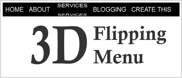
How To Add 3D Rotating Menu In Blogger Nairotech
How To Add 3D Rotating Menu In Blogger Nairotech
Nairotech Exclusively.. Today, we gon be dishing out a very lovely tutorial on Navigation (Horizontal) menu. After lots of discoveries we packaged this to suit every blogger template which doesnt need a Javascript or Javascript to function. It only needs Html and Css. You might also want to check our previous post on How To Edit Your Blog Easily With The New Blogger Template Editor
Steps To Add The Widget To Blogger
- Head to your Blogger dashboard
- Template >> Click Edit HTML
- Then find ]]></b:skin> & paste the below code justbefore ]]></b:skin>
/* 3d Flipping Menu By Nairotech.com */
.block-menu {
display: block;
background: #000;
}
.block-menu li {
display: inline-block;
}
.block-menu li a {
color: #fff;
display: block;
text-decoration: none;
font-family: Passion One,Arial,sans-serif;
-webkit-font-smoothing: antialiased;
-moz-font-smoothing: antialiased;
font-smoothing: antialiased;
text-transform: uppercase;
overflow: visible;
line-height: 20px;
font-size: 24px;
padding: 15px 10px;
}
/* animation domination */
.three-d {
-webkit-perspective: 200px;
-moz-perspective: 200px;
perspective: 200px;
-webkit-transition: all .07s linear;
-moz-transition: all .07s linear;
transition: all .07s linear;
position: relative;
}
.three-d:not(.active):hover {
cursor: pointer;
}
.three-d:not(.active):hover .three-d-box,
.three-d:not(.active):focus .three-d-box {
-moz-transform: translateZ(-25px) rotateX(90deg);
-webkit-transform: translateZ(-25px) rotateX(90deg);
-o-transform: translateZ(-25px) rotateX(90deg);
transform: translateZ(-25px) rotateX(90deg);
}
.three-d-box {
-webkit-transition: all .5s ease-out;
-moz-transition: all .5s ease-out;
-ms-transition: all .5s ease-out;
-o-transition: all .5s ease-out;
transition: all .5s ease-out;
-webkit-transform: translatez(-25px);
-moz-transform: translatez(-25px);
-o-transform: translatez(-25px);
transform: translatez(-25px);
-webkit-transform-style: preserve-3d;
-moz-transform-style: preserve-3d;
-ms-transform-style: preserve-3d;
-o-transform-style: preserve-3d;
transform-style: preserve-3d;
pointer-events: none;
position: absolute;
top: 0;
left: 0;
display: block;
width: 100%;
height: 100%;
}
.front {
-webkit-transform: rotatex(0deg) translatez(25px);
-moz-transform: rotatex(0deg) translatez(25px);
-o-transform: rotatex(0deg) translatez(25px);
transform: rotatex(0deg) translatez(25px);
}
.back {
-webkit-transform: rotatex(-90deg) translatez(25px);
-moz-transform: rotatex(-90deg) translatez(25px);
-o-transform: rotatex(-90deg) translatez(25px);
transform: rotatex(-90deg) translatez(25px);
color: #FFE7C4;
}
.front, .back {
display: block;
width: 100%;
height: 100%;
position: absolute;
top: 0;
left: 0;
background: black;
padding: 15px 10px;
color: white;
pointer-events: none;
-moz-box-sizing: border-box;
box-sizing: border-box;
}
- Save Template
NOW,
- Head straight to Layout in your Blogger Dashboard >> Select a Gadget (Blog header section)
- Then Select JavaScript/HTML & paste the below code.
<ul class="block-menu">
<li><a href="#" class="three-d">
Home
<span class="three-d-box"><span class="front">Home</span><span class="back">Home</span></span>
</a></li>
<li><a href="#" class="three-d">
About<span class="three-d-box"><span class="front">About</span><span class="back">About</span></span>
</a></li>
<li><a href="#" class="three-d">
Services
<span class="three-d-box"><span class="front">Services</span><span class="back">Services</span></span>
</a></li>
<li><a href="#" class="three-d">
Blog
<span class="three-d-box"><span class="front">Blog</span><span class="back">Blog</span></span>
</a></li>
<li><a href="#" class="three-d">
Create this
<span class="three-d-box"><span class="front">Create this</span><span class="back">Create this</span></span>
</a></li>
</ul>
<li><a href="#" class="three-d">
Home
<span class="three-d-box"><span class="front">Home</span><span class="back">Home</span></span>
</a></li>
<li><a href="#" class="three-d">
About<span class="three-d-box"><span class="front">About</span><span class="back">About</span></span>
</a></li>
<li><a href="#" class="three-d">
Services
<span class="three-d-box"><span class="front">Services</span><span class="back">Services</span></span>
</a></li>
<li><a href="#" class="three-d">
Blog
<span class="three-d-box"><span class="front">Blog</span><span class="back">Blog</span></span>
</a></li>
<li><a href="#" class="three-d">
Create this
<span class="three-d-box"><span class="front">Create this</span><span class="back">Create this</span></span>
</a></li>
</ul>
- Change the highlighted section above
- Save.
Like our Facebook Fanpage Here: http://www.facebook.com/nairotech

Go to link Download
Subscribe to:
Posts (Atom)