Showing posts with label style. Show all posts
Showing posts with label style. Show all posts
Saturday, November 26, 2016
How to Enable Aero Glass Style in Windows 8
How to Enable Aero Glass Style in Windows 8
How to Enable Aero Glass Style in Windows 8
Aero glass style is the amazing feature of window 7 which is not present in window 8.If your are window 8 user and want to see aero style on your desktop then its not tough task.Following are some steps to enable Transparent Glass effect in windows 8,you can use same method to enable aero glass style.Follow the given below steps.
To activate Transparent Glass Effect in Windows 8, You need to Follow Some Simple steps.
Step 1: Right Click on you desktop and select Personalize. A windows will open Like the Below pic.

Step 2. As shown in the above pic , Click on high contrast White To enable that Theme, Then Click on Color.
Step 3.After Clicking on Color a window will Open. Dont do anything with that window, Leave it as it is.
Step 4. Right Click on Desktop Again and Click on Personalize, Now choose Windows Default Theme To enable it.

Step 5. Now Go back to color and Appearance Window that you kept open earlier and just click on Save Changes.
Thats it you will get the Aero Glass Effect in Windows 8 Too.
you may face some Graphical Curruption when You move any window but This is the closest To Get aero Glass effect in Windows 8
Go to link Download

Friday, November 25, 2016
How to add Contact form on Blogger Change Style Install it on Static Pages
How to add Contact form on Blogger Change Style Install it on Static Pages
While going through various widgets on blogger dashboard i came across a must use widget that everybody on the bloggersphere network should use on his/her blogsite, which is the contact form.
?
?
 |
| By Egbo Harold |
The contact form for Blogger has the following features:
- Field for the user name
- Field for email
- Submit Button
- Field for the message (text-area)
Screenshot

How to Add Contact Form to Blogger
To add it to your blog, just select the Layout tab, then click on Add a gadget in the section you want to show, for example, if is in the sidebar you want to add the contact form. Then, select the More gadgets tab and add the Contact Form gadget.
Styling Contact Form
As the background is transparent, the form will integrate well, but its easy to modify using Style Sheets (CSS) to the appropriate selectors. Heres an example:
/* Contact Form Container */
.contact-form-widget {
width: 500px;
max-width: 100%;
margin: 0 auto;
padding: 10px;
background: #F8F8F8;
color: #000;
border: 1px solid #C1C1C1;
box-shadow: 0 1px 4px rgba(0, 0, 0, 0.25);
border-radius: 10px;
}
/* Fields and submit button */
.contact-form-name, .contact-form-email, .contact-form-email-message {
width: 100%;
max-width: 100%;
margin-bottom: 10px;
}
/* Submit button style */
.contact-form-button-submit {
border-color: #C1C1C1;
background: #E3E3E3;
color: #585858;
width: 20%;
max-width: 20%;
margin-bottom: 10px;
}
/* Submit button on mouseover */
.contact-form-button-submit:hover{
background: #4C8EF9;
color: #ffffff;
border: 1px solid #FAFAFA;
}
.contact-form-widget {
width: 500px;
max-width: 100%;
margin: 0 auto;
padding: 10px;
background: #F8F8F8;
color: #000;
border: 1px solid #C1C1C1;
box-shadow: 0 1px 4px rgba(0, 0, 0, 0.25);
border-radius: 10px;
}
/* Fields and submit button */
.contact-form-name, .contact-form-email, .contact-form-email-message {
width: 100%;
max-width: 100%;
margin-bottom: 10px;
}
/* Submit button style */
.contact-form-button-submit {
border-color: #C1C1C1;
background: #E3E3E3;
color: #585858;
width: 20%;
max-width: 20%;
margin-bottom: 10px;
}
/* Submit button on mouseover */
.contact-form-button-submit:hover{
background: #4C8EF9;
color: #ffffff;
border: 1px solid #FAFAFA;
}
This is how it will look like after applying the style:

To add this style, go to Template > Edit HTML, click on the sideways arrow next to <b:skin>...</b:skin> and paste the code just above ]]></b:skin> (press CTRL + F to find it):

How To Add Contact Form In A Static Page
First step is to add the Contact Form gadget (Layout) and second, to edit the template (Template > Edit HTML) to remove most of the gadget. You have to search for the id "ContactForm", expand the widget by clicking on the black arrow on the left (same with the includable) and then delete the part that I have colored in red (see below):

Part to be removed:
<b:widget id=ContactForm1 locked=false title=Contact Form type=ContactForm>
<b:includable id=main>
<b:if cond=data:title != "">
<h2 class=title><data:title/></h2>
</b:if>
<div class=contact-form-widget>
<div class=form>
<form name=contact-form>
<p/>
<data:contactFormNameMsg/>
<br/>
<input class=contact-form-name expr_id=data:widget.instanceId + "_contact-form-name" name=name size=30 type=text value=/>
<p/>
<data:contactFormEmailMsg/> <span style=font-weight: bolder;>*</span>
<br/>
<input class=contact-form-email expr_id=data:widget.instanceId + "_contact-form-email" name=email size=30 type=text value=/>
<p/>
<data:contactFormMessageMsg/> <span style=font-weight: bolder;>*</span>
<br/>
<textarea class=contact-form-email-message cols=25 expr_id=data:widget.instanceId + "_contact-form-email-message" name=email-message rows=5/>
<p/>
<input class=contact-form-button contact-form-button-submit expr_id=data:widget.instanceId + "_contact-form-submit" expr_value=data:contactFormSendMsg type=button/>
<p/>
<div style=text-align: center; max-width: 222px; width: 100%>
<p class=contact-form-error-message expr_id=data:widget.instanceId + "_contact-form-error-message"/>
<p class=contact-form-success-message expr_id=data:widget.instanceId + "_contact-form-success-message"/>
</div>
</form>
</div>
</div>
<b:include name=quickedit/>
</b:includable>
</b:widget>
<b:includable id=main>
<b:if cond=data:title != "">
<h2 class=title><data:title/></h2>
</b:if>
<div class=contact-form-widget>
<div class=form>
<form name=contact-form>
<p/>
<data:contactFormNameMsg/>
<br/>
<input class=contact-form-name expr_id=data:widget.instanceId + "_contact-form-name" name=name size=30 type=text value=/>
<p/>
<data:contactFormEmailMsg/> <span style=font-weight: bolder;>*</span>
<br/>
<input class=contact-form-email expr_id=data:widget.instanceId + "_contact-form-email" name=email size=30 type=text value=/>
<p/>
<data:contactFormMessageMsg/> <span style=font-weight: bolder;>*</span>
<br/>
<textarea class=contact-form-email-message cols=25 expr_id=data:widget.instanceId + "_contact-form-email-message" name=email-message rows=5/>
<p/>
<input class=contact-form-button contact-form-button-submit expr_id=data:widget.instanceId + "_contact-form-submit" expr_value=data:contactFormSendMsg type=button/>
<p/>
<div style=text-align: center; max-width: 222px; width: 100%>
<p class=contact-form-error-message expr_id=data:widget.instanceId + "_contact-form-error-message"/>
<p class=contact-form-success-message expr_id=data:widget.instanceId + "_contact-form-success-message"/>
</div>
</form>
</div>
</div>
<b:include name=quickedit/>
</b:includable>
</b:widget>
After you have saved the template, go to Pages and paste the following code into a new blank page with the title you want:
<div class=widget ContactForm id=ContactForm1>
<div class=contact-form-widget>
<div class=form>
<form name=contact-form>
<p>Name<p>
<input class=contact-form-name id=ContactForm1_contact-form-name name=name size=30 type=text value=/>
<p>E-mail *</p>
<input class=contact-form-email id=ContactForm1_contact-form-email name=email size=30 type=text value=/>
<p>Message *</p>
<textarea class=contact-form-email-message cols=25 id=ContactForm1_contact-form-email-message name=email-message rows=5></textarea>
<input class=contact-form-button contact-form-button-submit id=ContactForm1_contact-form-submit type=button value=Submit/>
<p class=contact-form-error-message id=ContactForm1_contact-form-error-message></p>
<p class=contact-form-success-message id=ContactForm1_contact-form-success-message></p>
</form>
</div>
</div>
</div>
<div class=contact-form-widget>
<div class=form>
<form name=contact-form>
<p>Name<p>
<input class=contact-form-name id=ContactForm1_contact-form-name name=name size=30 type=text value=/>
<p>E-mail *</p>
<input class=contact-form-email id=ContactForm1_contact-form-email name=email size=30 type=text value=/>
<p>Message *</p>
<textarea class=contact-form-email-message cols=25 id=ContactForm1_contact-form-email-message name=email-message rows=5></textarea>
<input class=contact-form-button contact-form-button-submit id=ContactForm1_contact-form-submit type=button value=Submit/>
<p class=contact-form-error-message id=ContactForm1_contact-form-error-message></p>
<p class=contact-form-success-message id=ContactForm1_contact-form-success-message></p>
</form>
</div>
</div>
</div>
Messages will be sent to the same email that you have registered in Blogger.
Hope you enjoyed this tutorial? Please, use the share buttons and make sure you drop a comment below so i can know if my little tutorial helped or not.Thanks for stopping by!
Go to link Download
Friday, November 18, 2016
How to Change and Create a Android Logo In accordance in your own style with Androidify
How to Change and Create a Android Logo In accordance in your own style with Androidify
How to Change and Create a Android Logo In accordance in your own style with Androidify - Whats Androidify - Androidify is made google android applications that can make your avatar with andaroid logo, or in other words able to make the android logo in accordance with its own character. So far we know the logo android as a robot in green and shaped rigid, android logo google himself calls it by the name "andy". Then how about if we contumisasi the android logo in accordance with our wishes. add a variety of knick-knacks, and accessories in accordance with the latest fashion styles. Interesting is not it? see the image below.
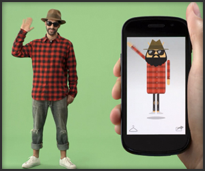
Androidify create our own android logo according to the character and fashion we
What can be done with Androidify
With Androidify we can change the android logo as we want, we can add the hair, adding to the variety Eksen fashion clothes and accessories, add glass eyes, adding pants, adding shoes, add hats, mustaches, jangut, and all things that smell fashion Style . Be logo android models themselves.
How to make own android with Androidify logo
I use it quite easy you just need to install this free app via google android play store open and make your hearts content. there is no limit we can tamper add modifiers themselves according to their own desires then we can also membagikanna our edits to various social networks such as google plus, facebook, twitter or email.
below is a screenshot application androidify

Features the latest androidify
• Currently available almost all fashion accessories that can be customized to the android logo, with the word lai we can it about with android logo at will
• make available tutorials android logo with androidify
• share feature to various social networks such as Google Plus, twitter, and facebook
Download Androidify Android apk
Official android application created by Google Inc. and is available free for download via google play for free. Androidify latest version is 1.1.3. Cdengan apk 2.1Mdan sizes can be installed for both katas android 2.1 OS smartphone / android phone and android tablet
Download Androidify Android apk app via google play store or click here
Androidify create our own android logo according to the character and fashion we
What can be done with Androidify
With Androidify we can change the android logo as we want, we can add the hair, adding to the variety Eksen fashion clothes and accessories, add glass eyes, adding pants, adding shoes, add hats, mustaches, jangut, and all things that smell fashion Style . Be logo android models themselves.
How to make own android with Androidify logo
I use it quite easy you just need to install this free app via google android play store open and make your hearts content. there is no limit we can tamper add modifiers themselves according to their own desires then we can also membagikanna our edits to various social networks such as google plus, facebook, twitter or email.
below is a screenshot application androidify
Features the latest androidify
• Currently available almost all fashion accessories that can be customized to the android logo, with the word lai we can it about with android logo at will
• make available tutorials android logo with androidify
• share feature to various social networks such as Google Plus, twitter, and facebook
Download Androidify Android apk
Official android application created by Google Inc. and is available free for download via google play for free. Androidify latest version is 1.1.3. Cdengan apk 2.1Mdan sizes can be installed for both katas android 2.1 OS smartphone / android phone and android tablet
Download Androidify Android apk app via google play store or click here
Go to link Download
Subscribe to:
Posts (Atom)